A Small Update That Fixes a Big Frustration
If you’ve ever edited your own WordPress website, you’ve probably run into this: a headline looks great on your laptop, then wraps into five awkward lines on your phone. Or a big image pushes everything important below the fold on mobile.
Until recently, fixing that meant custom code, a page builder, or an extra plugin. Now WordPress has started to handle it on its own.
Recent versions of WordPress include responsive styles and block visibility right in the editor. I’ve been testing them on client sites, and here’s what business owners should know.
What Responsive Styles Do
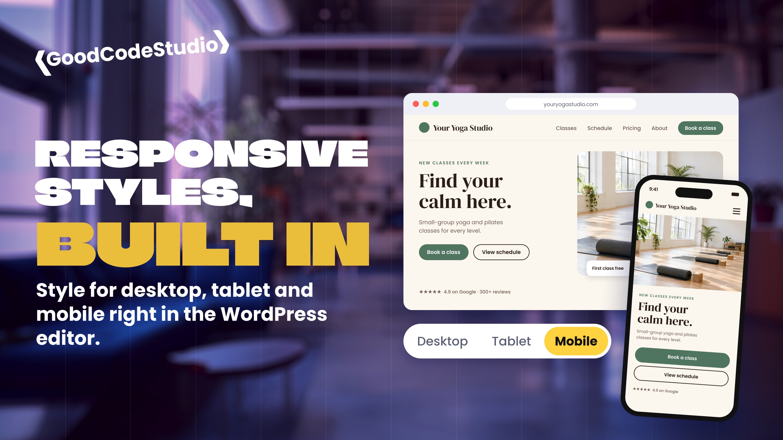
In the editor, you can switch the preview between desktop, tablet, and mobile. With a block selected, you then choose whether your style changes apply to every screen size or only to the one you’re previewing.
That means you can:
- Make a large headline smaller on phones without changing it on desktop
- Adjust spacing so sections don’t feel cramped on a small screen
- Fine-tune how a block looks on tablets without touching the rest of the site
Before, most of those changes applied everywhere at once. Fixing the mobile version often broke the desktop one.
What Block Visibility Does
You can also hide a block on specific screen sizes. A few common uses:
- A wide image or detailed table that works on desktop but not on a phone
- A shorter version of a section written just for mobile visitors
- A “Call now” button that only makes sense on phones
Use this one carefully. Hidden content is still part of the page, so it isn’t a way to hide outdated information. If something shouldn’t be on your site, remove it.
Why This Matters for Small Businesses
More than half of most websites’ visitors are on their phones. For many local businesses and nonprofits, it’s much higher than that.
If your mobile site is hard to read, people leave. And Google looks primarily at the mobile version of your site when deciding how to rank it.
Built-in responsive controls mean you, or whoever updates your site, can fix mobile problems directly in the editor without waiting on a developer for every small change.
What to Check Before You Rely on It
This is a new feature, and like most new WordPress features, it’s still maturing. A few things I’ve noticed in testing:
- It doesn’t work everywhere yet. On one site, responsive styles worked inside pages but didn’t take effect in the site footer. Test each area of your site before assuming it works there.
- Your theme matters. Some themes and plugins already add their own mobile settings, and the two can overlap. If a change doesn’t show up, something else may be overriding it.
- Not every setting is responsive. Some style options can be set per screen size and some can’t. Check before you plan a design around it.
- Always check on a real phone. The editor preview is helpful, but it isn’t a perfect copy of every device.
On my own site, I still use a small custom tool for responsive styling in places where the built-in version doesn’t reach yet. That will change as WordPress catches up.
Keep Your WordPress Site Updated
Features like this only reach your website if it’s running a current version of WordPress. If your site is several versions behind, you’re missing improvements like this, along with important security fixes.
Updates should be tested before they go live, especially on business websites, but they shouldn’t be skipped.
Final Thoughts
Responsive styles are a big step forward for anyone who edits their own WordPress website. They make it much easier to give mobile visitors a good experience without custom code.
They’re also part of a bigger shift: WordPress’s built-in editor keeps getting more capable, which is one reason I build with it instead of heavy page builders. (I wrote more about that in Why Native Gutenberg Beats Page Builders.)
If your website looks great on desktop but not on phones, or you’re not sure your site is up to date, WordPress maintenance plans keep everything current and tested. Or get in touch and I’ll take a look.