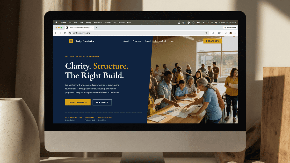
The First Screen Sets the Tone
When someone lands on your website, they’re asking one silent question:
“Am I in the right place?”
Your above-the-fold section should answer that instantly.
That means:
- A clear value statement
- A specific audience callout (if applicable)
- A focused call to action
- Visual reinforcement, not distraction
If visitors have to scroll to understand what you do, your messaging needs refinement.
Clarity Outperforms Cleverness
Clever headlines can be memorable — but clarity converts.
Instead of vague statements like:
“We Build Digital Experiences”
Try:
“Custom WordPress Development for Nonprofits and Growing Organizations”
Specificity builds confidence.
Your CTA Should Be Singular and Obvious
Too many primary buttons create hesitation.
Strong homepages usually emphasize:
- One primary action (Contact, Book a Call, Donate)
- One secondary action (Learn More, Explore Services)
Hierarchy matters.
Design Supports Message
Typography, spacing, and color contrast influence where the eye moves.
When design is intentional:
- Important elements stand out.
- Reading feels effortless.
- Navigation feels intuitive.
A strong homepage doesn’t overwhelm. It guides.
Ready to build something custom? Let’s talk about your project.
👉 Contact Good Code Studio or email hello@thatgoodcode.com.