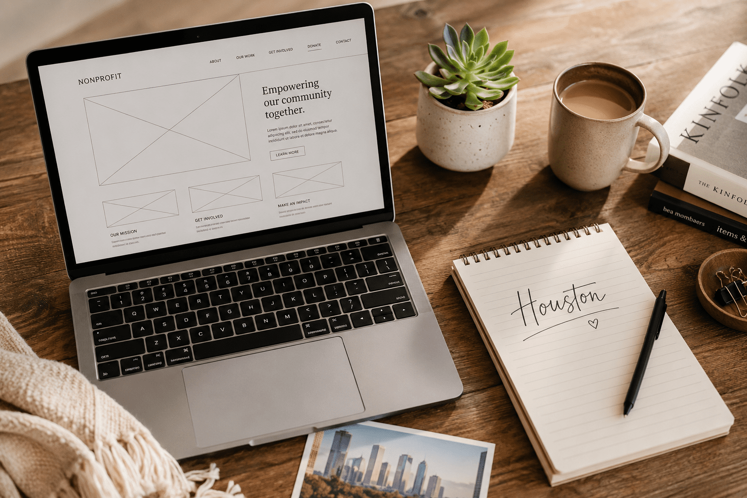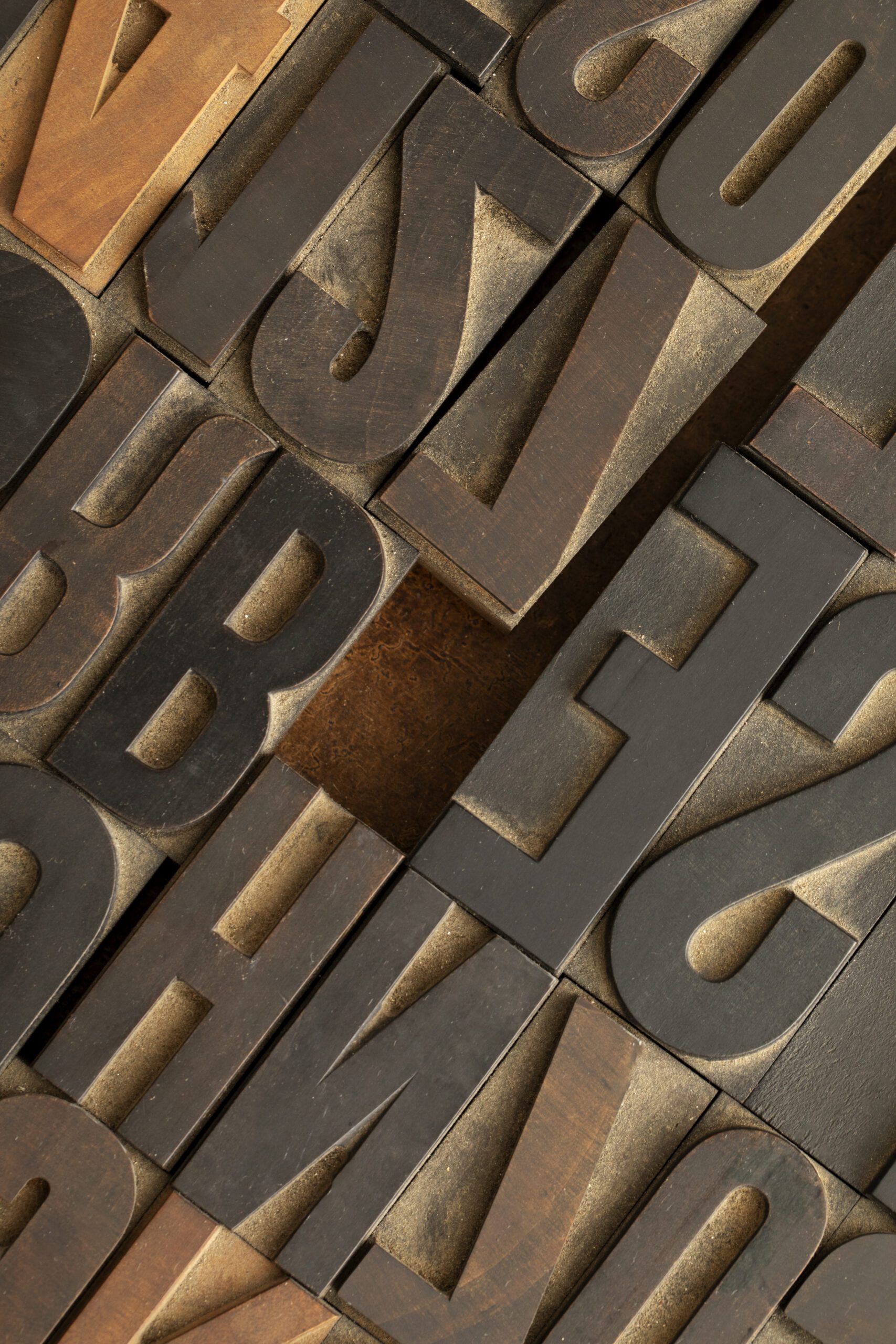
Typography Creates First Impressions
Within seconds of landing on your website, visitors form assumptions about:
- Professionalism
- Stability
- Credibility
- Modernity
Those assumptions are driven heavily by typography.
Is your headline:
- Clear and strong?
- Overly thin and hard to read?
- Crowded against the edges?
- Inconsistent across pages?
Typography communicates structure before content is fully processed.
Hierarchy Guides Attention
Strong WordPress design uses clear hierarchy:
- One primary H1
- Distinct H2 sections
- Supporting H3 subpoints
- Intentional spacing between blocks
When hierarchy is unclear, users feel friction.
They scroll without direction.
They skim instead of engage.
Clear hierarchy:
- Improves readability
- Supports SEO
- Reduces cognitive load
- Increases time on page
Design supports comprehension.
Spacing Is as Important as Font Choice
Many websites feel overwhelming not because of content — but because of spacing.
Intentional spacing:
- Creates breathing room
- Highlights key ideas
- Improves scannability
- Reduces visual fatigue
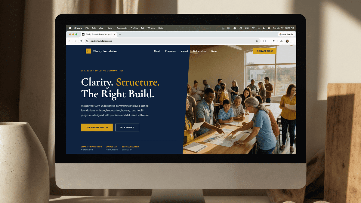
Especially for nonprofits and service-based organizations, clarity is critical. Visitors need to quickly understand mission, services, and next steps.
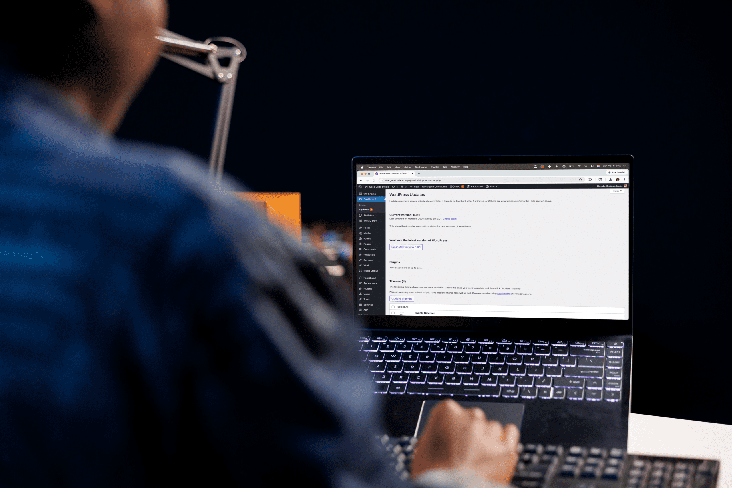
Accessibility Is Part of Good Design
Typography affects accessibility in ways many overlook:
- Line height impacts readability
- Font weight affects clarity
- Contrast impacts visibility
- Paragraph length affects comprehension
Inclusive design isn’t optional.
A thoughtful WordPress build ensures typography works across:
- Desktop
- Tablet
- Mobile
- High-resolution displays
- Lower-vision contexts
Design isn’t about trend chasing. It’s about communication.
At Good Code Studio, design decisions are intentional — because clarity builds trust.
Ready to build something custom? Let’s talk about your project.
👉 Contact Good Code Studio or email hello@thatgoodcode.com.